Whilst listening to the album, and looking in to interviews, I began to draw an image of Tom and Josh from Jungle, this was the only image I could find of them, this drawing later became my editorial image. Along with this drawing I also drew a few of the people from the video's, mainly focusing on the video "The Heat", which features two men on roller-blades dancing in what looks to be a dilapidated warehouse.
At this point I had came up with my initial idea, I explain this further in my post on Concept. So I began drawing buildings, and practising how to make them look dilapidated, I also started looking at books on jungles, and drawing the plants from that.
Part way through drawing the buildings and characters I drew an image of a man covered in vines, this image would become the left character on my album cover. Around this time I changed my concept, when listening to the album and looking through my sketchbook, I really felt that nothing I had drawn fit well with the music, except for the vine man. All of the crumbling buildings really didn't feel happy, yet listening to the music, it's upbeat and atmospheric.
I really wanted to go forward with my vine man image, as I thought that it reflected the band perfectly, obscuring their identities was a focus through this project, as during an interview they said they didn't want to become vain, they wanted their musical careers to be about the music, and not about themselves.
I took my vine man drawing digital using the cintiq, and when happy with that, I sketched the second man and took that digitally aswell.
After completing the album cover and using a template to print, I got the idea of a box for my product. You can see the production of my box on my Product process post. I wanted to make the packaging of the CD have a mysterious jungle vibe in a literal sense, and I thought that I could successfully achieve the feel of this product through my love of woodworking.
Showing posts with label Funk. Show all posts
Showing posts with label Funk. Show all posts
Wednesday, 5 November 2014

Monday, 3 November 2014
JUNGLE: Editorial Image Process
When researching initially for Jungle, I found an interview with a photo of Josh and Thomas, with a picture attached. In this picture they were stood like this, and it looked as though Josh was mad at Thomas, this was the first drawing I did of Jungle, and I think it is appropriate to use it again, i brought it digital using the Cintiq.


JUNGLE: Poster Image Process
The conceot behind my album poster was to make it look as though the album was laying in an urban setting with the shadows of a canopy over top, and a snake out of view
.png)
.png)
.png)
.png)
.png)
.png)
.png)
.png)
.png)
.png)
.png)
.png)
.png)
.png)
.png)
.png)
.png)
.png)

Saturday, 1 November 2014
JUNGLE: CD Packaging Image Process


.png)
Here is the lineart, I used a cintiq, and a sketching brush on the pencil tool, for clean lines
.png)
.png)
.png)
.png)
I added a black border and the Jungle logo
.png)
.png)
.png)


JUNGLE: Product process
For my product I wanted to hand make a box that had the same feel as the Jumanji box, to put my CD in, i think that this idea really works because of the jungle theme.

 Here is the rough assembly of the box frame, with another album in fro refference
 I created this frame using mitred joints, which are cuts at a 45 degree angle
 Here I glued the two short sides to the base, and nailed them in from the bottom
 Added the two remaining sides in the same way, the box body is now assembled
 Here I started chiselling out the spaces for the hinges, so that they would sit flush
 test fits
 all of the holes chiselled out
 Assembled, and now ready for staining

 After staining, I used a Gold Sharpie, and a rough template to write JUNGLE, and draw out the frame, I then touched it up for neater edges.


Monday, 13 October 2014
JUNGLE: Artist Research
Artist Research
Looking at Henri Rousseau has definitely helped me see what makes an image look and feel like a jungle. All of the trees and plants are very tightly packed together with not much room between them. This gives a sense of overgrowth and wildness. Many jungle plants in these images are long with lots of long thin leaves, I think this really does establish the setting, as does the sense of depth and layering, it makes it feel vast and expansive.


Micha Lindberg
Micha Lindberg is an artists that works frequently with Nobrow, her work is quite chaotic, which is contradictory to how i want to go forth with this project, but her work is still on the theme of the jungle and personally i find it beautiful, the bright vibrant colours, contrasting with the dark backdrop.


Llew Mejia
Llew Mejia creates repeat patterns that i think really capture the jungle, the lack of a base or floor really makes it feel expansive. The colours are beautiful, and remind me of classic sci fi posters.


Storm Thorgerson
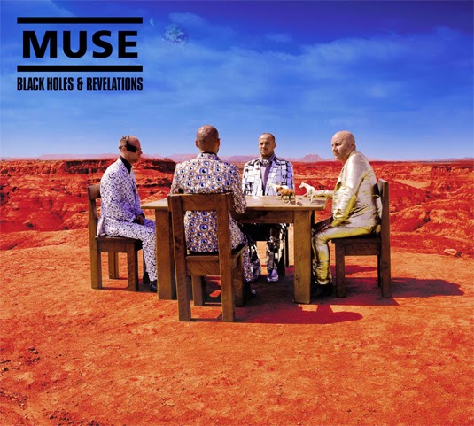
Storm Thorgerson is probably the most iconic album cover designers, and one of my personal favourite artists, his work is all one shot photographs, meaning they aren't manipulated other than colour, he spent many hours setting up his photographs, and i think they have such beauty and impact, the top two, are two of my favourite album covers.



Looking at Henri Rousseau has definitely helped me see what makes an image look and feel like a jungle. All of the trees and plants are very tightly packed together with not much room between them. This gives a sense of overgrowth and wildness. Many jungle plants in these images are long with lots of long thin leaves, I think this really does establish the setting, as does the sense of depth and layering, it makes it feel vast and expansive.
Micha Lindberg
Micha Lindberg is an artists that works frequently with Nobrow, her work is quite chaotic, which is contradictory to how i want to go forth with this project, but her work is still on the theme of the jungle and personally i find it beautiful, the bright vibrant colours, contrasting with the dark backdrop.
Llew Mejia
Llew Mejia creates repeat patterns that i think really capture the jungle, the lack of a base or floor really makes it feel expansive. The colours are beautiful, and remind me of classic sci fi posters.
Storm Thorgerson
Storm Thorgerson is probably the most iconic album cover designers, and one of my personal favourite artists, his work is all one shot photographs, meaning they aren't manipulated other than colour, he spent many hours setting up his photographs, and i think they have such beauty and impact, the top two, are two of my favourite album covers.
Subscribe to:
Posts (Atom)